The Esteemed Gentleman Articles
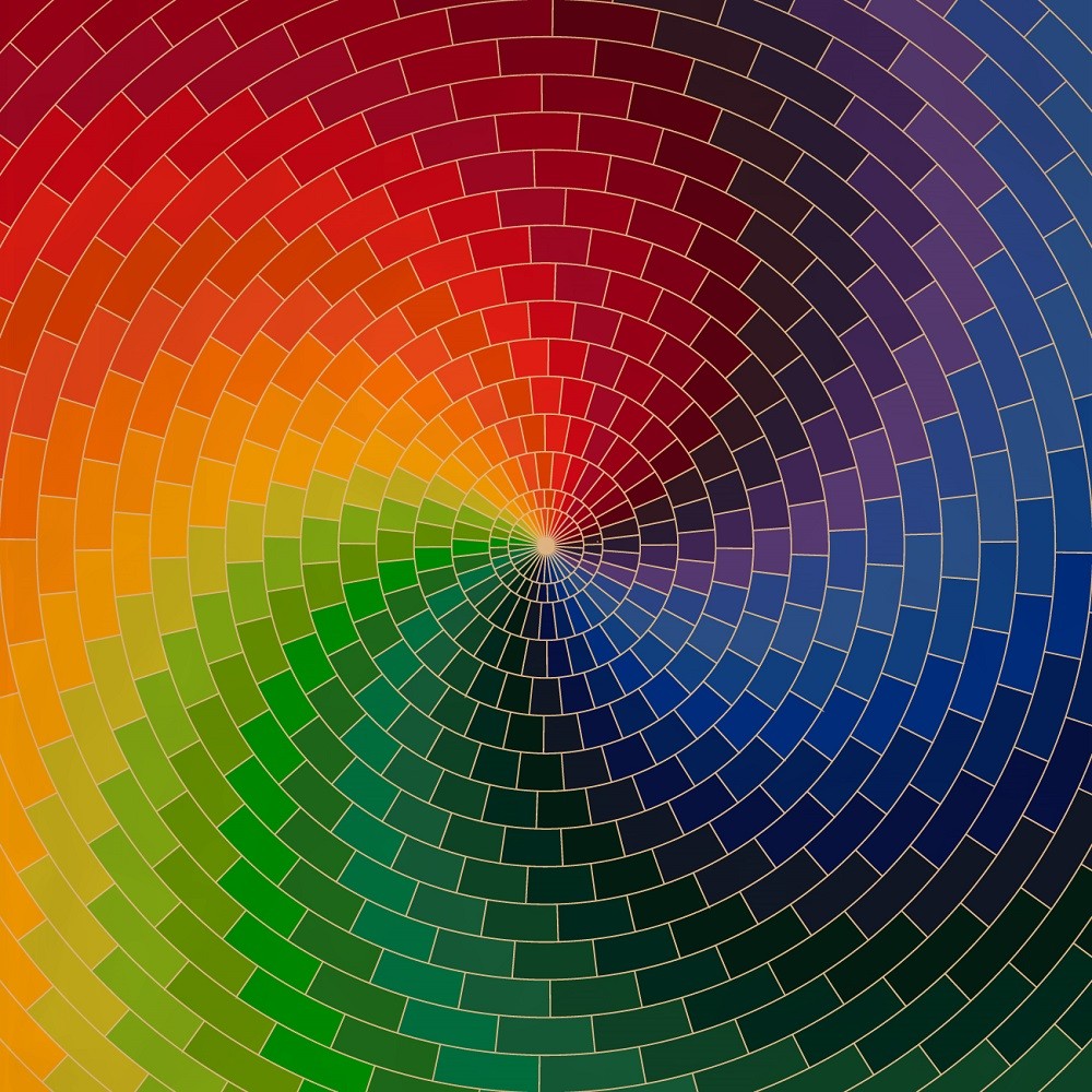
A Beginners Guide To The Colour Wheel
Knowing how to build a wardrobe can be a daunting task. One of the pillars of dressing well is understanding how colours work together. This beginners guide to the colour wheel will help you to create more harmonious outfits with less effort.
Disclaimer: Throughout the article you will see the word 'colour' spelt with and without a 'U'. Esteemed Gentleman is a Canadian company so we spell it with the U. Sorry, eh.
What Is A Colour Wheel?
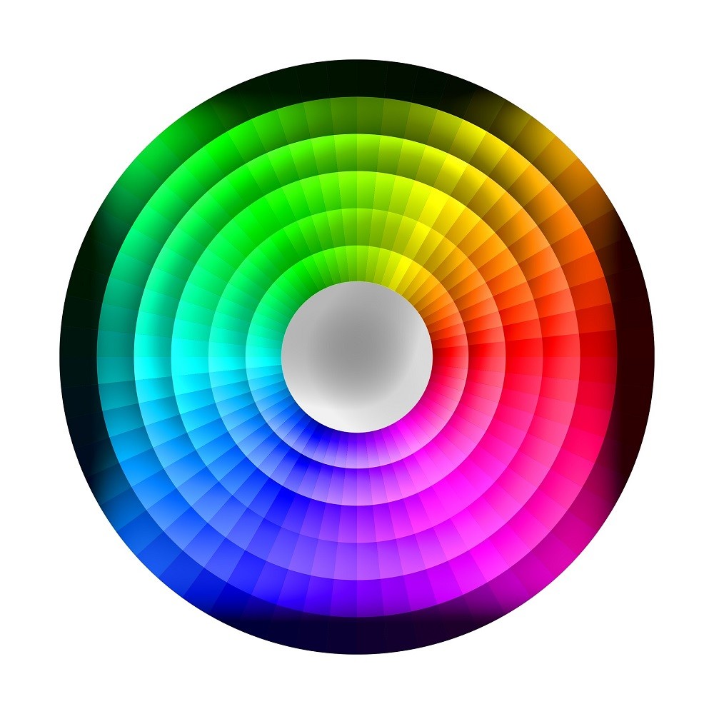
A colour wheel illustrates the relationships between primary, secondary, and tertiary colours. Using the wheel, you can develop a harmonious colour scheme for your outfits that will look complete and well thought out. In time, you will be able to recognize which colours go well together and which ones should be avoided.
A basic colour wheel will only show you the hue, or true colour, whereas a modern colour wheel will show you aspects like shade, tone, and tint, which will be discussed later in this article.
What Are Primary Colours?
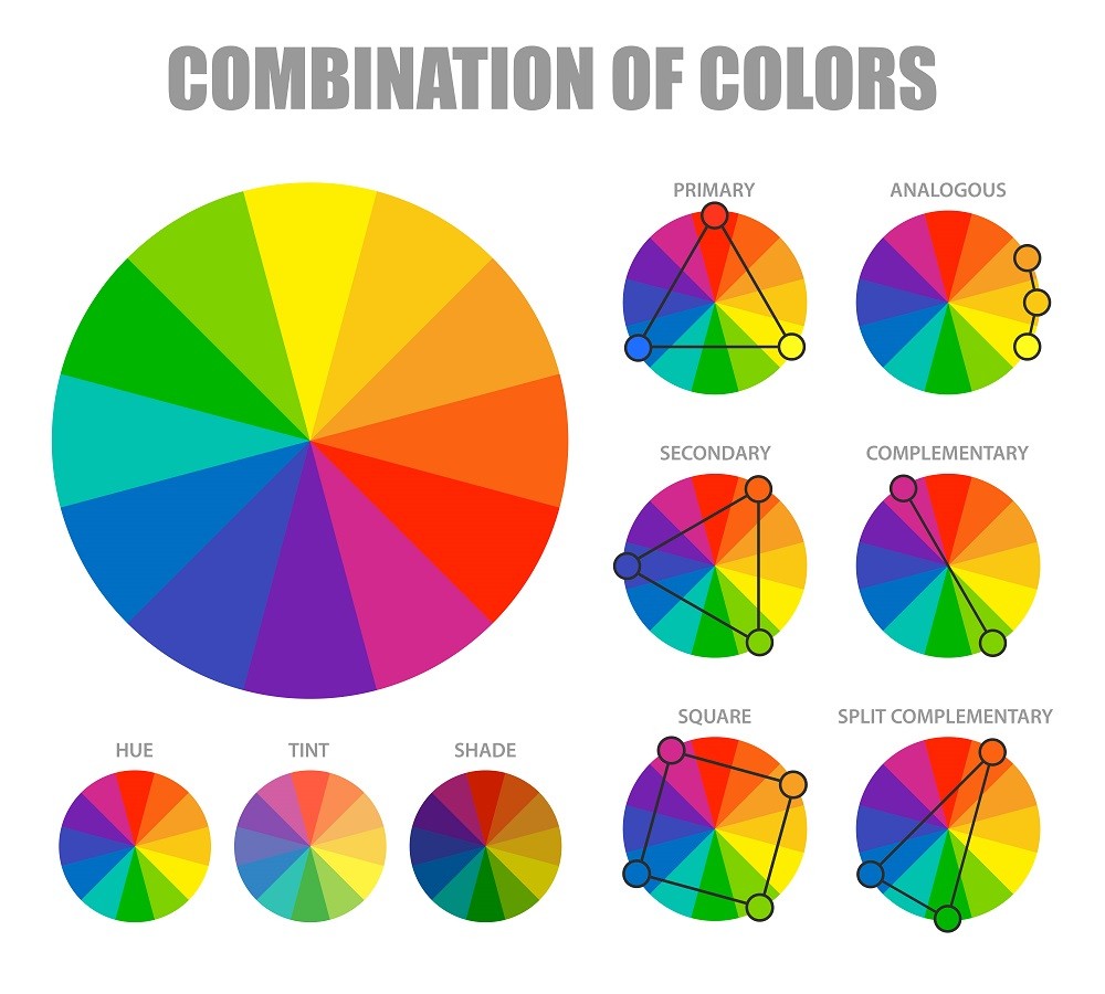
Primary colours are the original colours that make up every other colour. Think of them as the parent colours. The three primary colours are red, blue, and yellow, and with them, you can create any hue imaginable.
Want to know what colour to wear on a date? Red. Not only has it been attributed to be a dominant colour, it also invokes feelings of desire, love, and confidence. The article, How The Color Red Influences Our Behavior, by the Scientific American goes into more detail.
What Are Secondary Colours?
Secondary colours arise from the mixing of two primary colours. On the colour wheel, a secondary colour will always be across from a primary. Secondary colours are orange (red + yellow), green (blue + yellow), and purple (red + blue).
What Are Tertiary Colours?
Tertiary colours are the intermediate steps that bridge secondary and primary colours. These are a combination of a primary and secondary colour. Typically, their names are kept simple, combining the names of the colours used; for example, yellow + green = yellow-green. These colours can add a beautiful complex accent to your outfit.
What Are Complimentary Colours?
Complimentary colours sit directly across from each other on the colour wheel. Examples of complementary pairs are red/green, blue/orange, and purple/yellow. Using complementary colours in your wardrobe creates a vibrant look characterized by stark contrast.
What Are Analogous Colours?
Sets of three neighbouring colours on the colour wheel are considered analogous. Typically found in nature, analogous colour schemes are harmonious and easy on the eyes. If you want to create an analogous look, use one colour as your base (typically the middle colour), then the other two colours as your accents. This will give your outfit balance and variety.
What Are Triadic Colours?
Triadic colours are any three hues that are evenly spaced around the colour wheel. Since you are including contrasting colours in your outfit, triadic schemes are usually vibrant. Just like with analogous colour schemes, use one colour as your base then the other two as accents.
Warm Colours Vs. Cool Colours
You may have heard the terms "warm colours" and "cool colours". Warmer colours are red, orange, yellow and magenta hues of purple. Cooler colours are green, blue, and violet hues of purple. Warmer colours stimulate us while cooler colours relax us. SAGE Journals ran a study with college students. Their journal The Effects Of Color On The Moods Of College Students explains their findings.
Depending on your skin tone, you can incorporate more of these colours in your overall outfit. If your skin is lighter, stick to cooler colours. If your skin is darker, warmer colours will work better for you. This helpful Helpline article can help you figure out what skin tone you are and how to dress accordingly.
Want to know how to dress on a first date? Our article How To Dress On A First Date has you covered.
No Black? What's With That?
You may have noticed that black and white aren't on the colour wheel. That's because they are considered shades, not colours. One could argue that white is the combination of all colours on the visible light spectrum, but for this article, we don't call it a colour. You will find white, black, and all grey shades in a completely different place—a grey scale.
No Brown, Either?
Now you may be saying "That's all fine and good, but where's brown? Brown is a colour!" And you would be correct; it is a colour. Brown is a combination of red, yellow, and black, (or orange and black), making it a composite colour. A basic colour wheel will not depict brown, although you may find it on modern colour wheels sitting between orange and red.
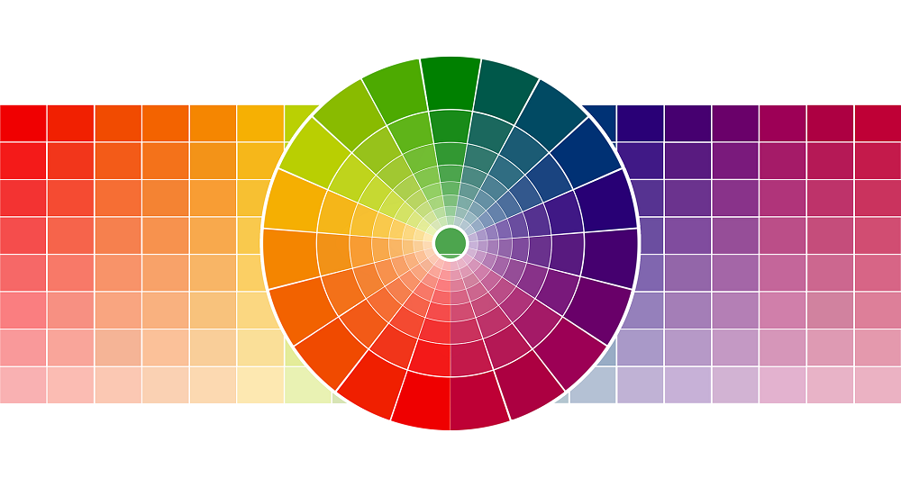
Shade, Tone, And Tint. What's The Difference?
You may come across a colour wheel with different shades, tones, and tints. These are typically used in modern colour wheels and can help you create a monochromatic look or add definition to an outfit. A monochromatic look is based around a singular colour and uses its shades, tones, and tints to create a harmonious, well put-together outfit.
Shade = hue + black
Tone = hue + grey
Tint = hue + white
Bonus Style Tips:
Tip 1: Find a free colour wheel app on the Apple App Store or Google Play. This will come in handy next time you are shopping for new attire. Being able to mix and match before purchasing anything means you can build an outfit in the store and try it before committing.
Tip 2: Lay out your accessories on top of your shirts, sport coats, and/or trousers to see how the colours play with each other.
Want to add a pop of colour to your wardrobe? Add a pocket square. They are fun accessories that can be dressed up or down. But always remember to NEVER match it with your tie. Our article A Simple Guide On How To Wear Pocket Squares will teach you everything you need to know about this versatile piece of square fabric.
Summary
Now that you are armed with colour knowledge, creating an astounding outfit will be much easier. Take time to try different combinations, styles, and patterns. Experiment with different shades and tones to really make your wardrobe pop. How you dress impacts how most people will perceive you, so always put effort into how you dress.
When you subscribe to the article, we will send you an e-mail when there are new updates on the site so you wouldn't miss them.
Article's Categories
Most Popular Articles


Article Latest Comments

Comments